Having multiple designers on a team is awesome. You get feedback easily as everyone has the same context, you can bounce ideas off each other when stuck, and generally have a great time designing together.
But as any great thing, it also comes with challenges. One of the biggest ones is consistency, even when working with a design system. Our personal style, design thinking and experience-based approaches can put their stamp on our designs, which means the product you’re working on can start looking disjointed and inconsistent. In a lot of teams I’ve been part of before, unfortunately we just had to… deal with it. The design debt would pile sky high and we’d end up rushing to clean everything up before launch. This would often make our development team’s jobs even harder, as we’d be sending them last minute changes.
If you’re thinking “there must be a better way”, there is! Whilst working on my previous project, our Design Director introduced me to what possibly is my absolute favourite new thing: a hygiene sprint. Potato is the first place I’ve worked at that allocates time for this, and it’s an absolute game changer.
What is a hygiene sprint?
A hygiene sprint can be treated like any other sprint within a team applying Agile methodologies. The ways of working are the same as always, only the focus is different. A hygiene sprint exists to create consistency amongst all features, screens and components the team has worked on.
Why a hygiene sprint is important
Working in tech, we’re probably all familiar with the term “technical debt” and what it means.
The same way developers need to compromise on the quality of their code and minimise documentation when working towards a tight deadline, designers often have to do the same, but with designs rather than code.
Therefore a term less often talked about is “design debt”. When we send rushed designs to the development team they can sometimes be unorganised, not adequately documented or inconsistent with brand guidelines and design systems.
How we planned our hygiene sprint
Our Design Director introduced me to hygiene sprints while working on a previous project in which we had to design a mobile application from scratch in three months.
In this tight timeframe, we had to create a minimum viable brand, run countless workshops with clients and future users, and roughly prototype and test the app's most important feature, which then informed the final product's design.
From the start, we agreed on working flexibly to ensure previously designed components worked across the application and were not too rigid. This meant small elements like buttons and dropdowns went through multiple iterations throughout the three-month timeframe.
With so much happening so quickly, design debt was unavoidable, so planning to tackle it was instrumental to delivering polished outputs and meeting the deadline. The fast pace of work meant we couldn't always go back to previous designs and update everything, so we agreed to have a hygiene sprint at the end of our engagement to work on checking that:
- All screens used consistent colour and typography styles.
- We used components everywhere - no cheeky detached instances.
- We documented what we used where and shipped the product together with a design system for the benefit of future designers.
How we executed our hygiene sprint
Get together to arrange a plan of action
For this project, we had 3 designers on the team. Each was responsible for 2-3 features. We kicked off the sprint by collecting ideas from each of us on what would be the best way to start and what we wanted to deliver at the end of the hygiene sprint.
Together, we came up with this high level plan:
- Gather all screens on one Figma page
- Audit the foundations of the app:
- Accessibility
- Colour
- Typography
- Spacing
- Logos & Icons
- Audit all components:
- Buttons
- Labels
- Form elements
- Cards
- Progress indicators
- etc.
- Make decisions on which components and elements stay and which ones will have to change
- Stay in constant communication with our development team to ensure all changes are possible and also feasible in their timeline
Auditing all elements and components
Once we put all screens in one place, we divided the auditing actions between the 3 of us. We tried to keep things equal and make sure the person who worked most with one particular element would be the one responsible for auditing it. For example, Tammy, one of the designers on the team, was the one who researched and chose the icon kit, therefore she was the best person to audit the app’s iconography.
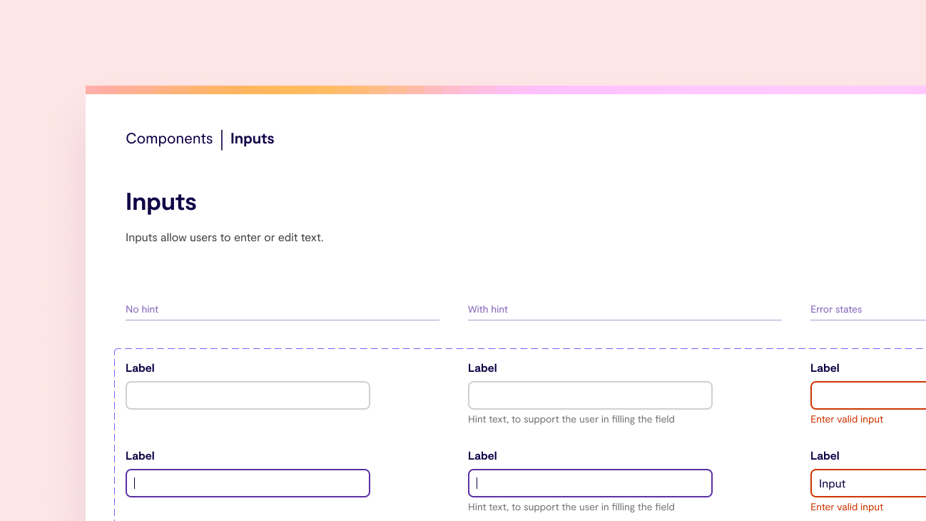
Also, I was the one who worked on all form elements, so I made sure they’re all consistent and we have all relevant states available.
Create a design system for future designers working on the app
To ensure the consistency we aimed for was not short lived, we decided to ship the screens together with a design system and a Figma library to match.
Knowing we're likely not going to be the only designers making changes to the app in the future, we wanted to ensure other designers wouldn't be overwhelmed with questions and had everything they needed.
We can discuss the benefits of a design system another time, but it’s safe to say this was an important step for us.
The thinking behind who audits what element followed in the design system as well. Since I worked most with form elements, audited them to ensure consistency, I was also the one who documented how to use them in our design system.
Deliver all updated screens to the development team
Whilst we kept the development team in the loop regularly, we wanted them to have a clean and clear single source of truth by the end of our engagement.
As a result, we didn’t only send them the design system, documenting all tokens, components and how to use them. We also sent them a Figma file with every single screen and interaction, to make sure they can refer to it even when we’re no longer there.
A habit worth cultivating
Potato is the first team I've worked with that allocates time for hygiene sprints, and it's an absolute game-changer. They prove very powerful from a delivery perspective and a team morale point of view.
It’s easy to get worried about designs growing inconsistent when we deliver feature after feature with little time for reflection. But with a hygiene sprint planned for, we don’t have to. We know that when we say “I’ll clean this up later”, that “later” is guaranteed to come and we have that time accounted for in our plan.
To me, that peace of mind is extremely valuable, and as a result have planned for a hygiene sprint on my current project as well. We’re hoping this approach will continue to give the design team peace of mind and also improve design-dev collaboration.


